Visualizing Weather
MIT 4.032 Project 2 by Alisa Ono
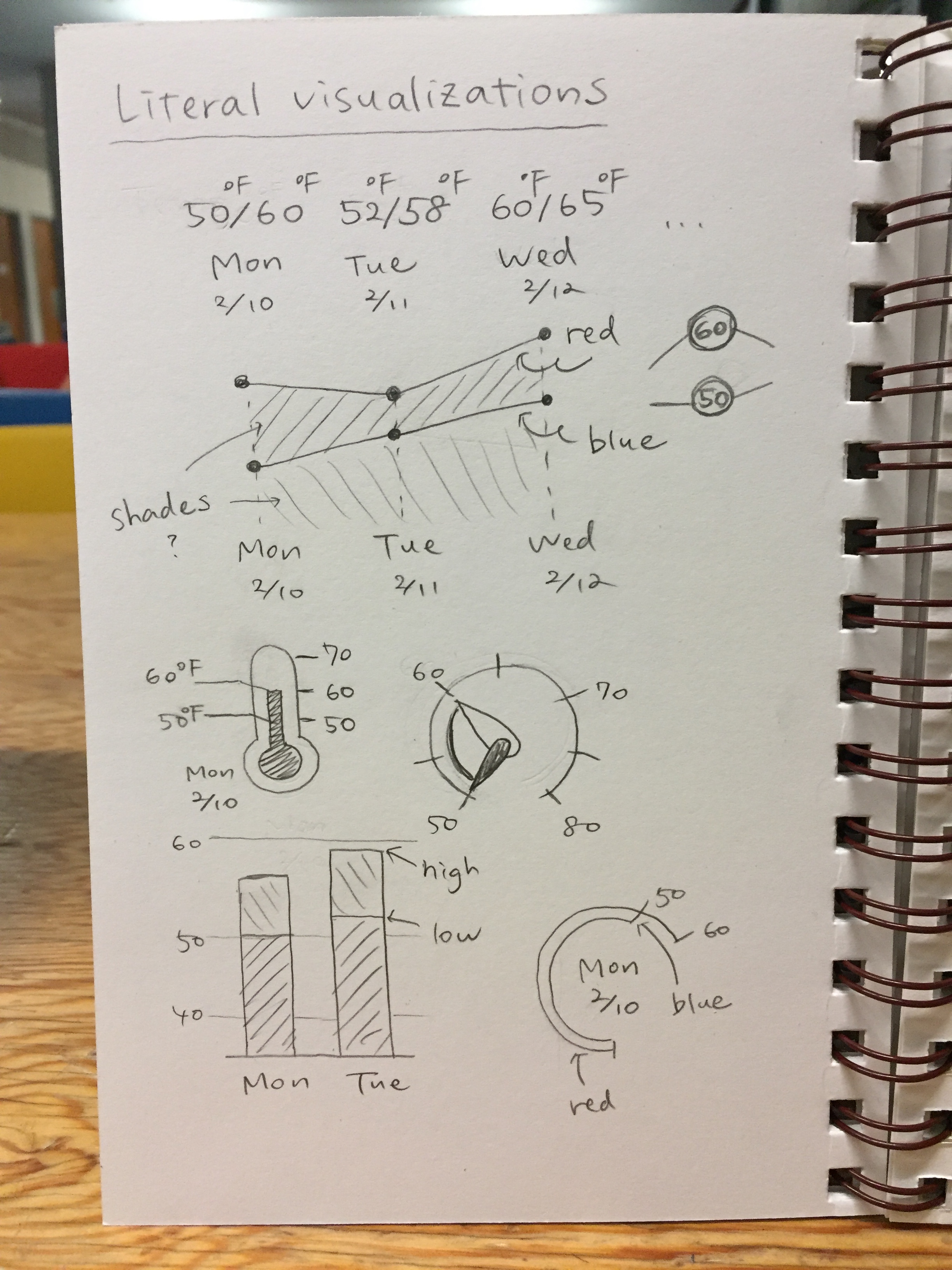
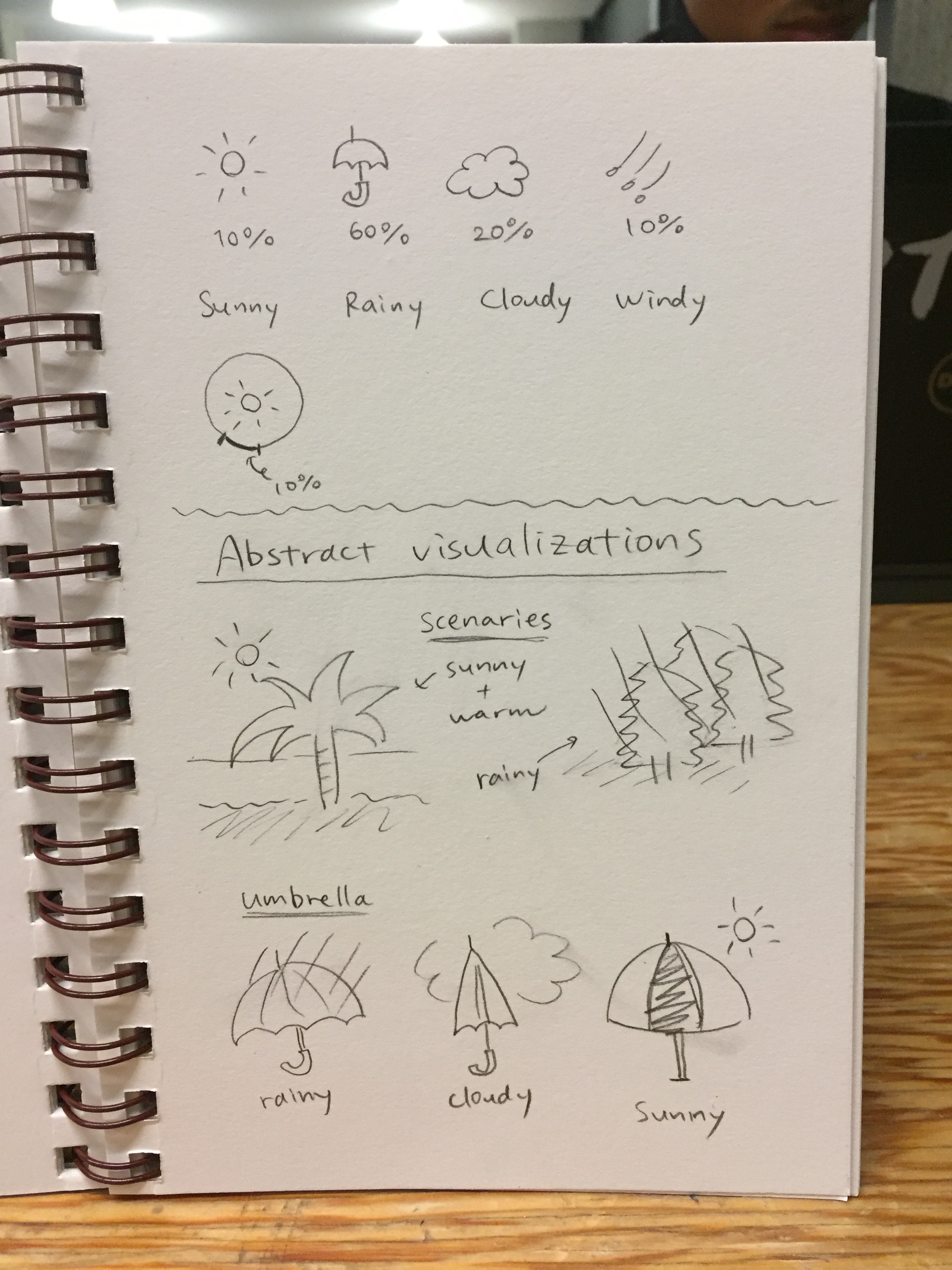
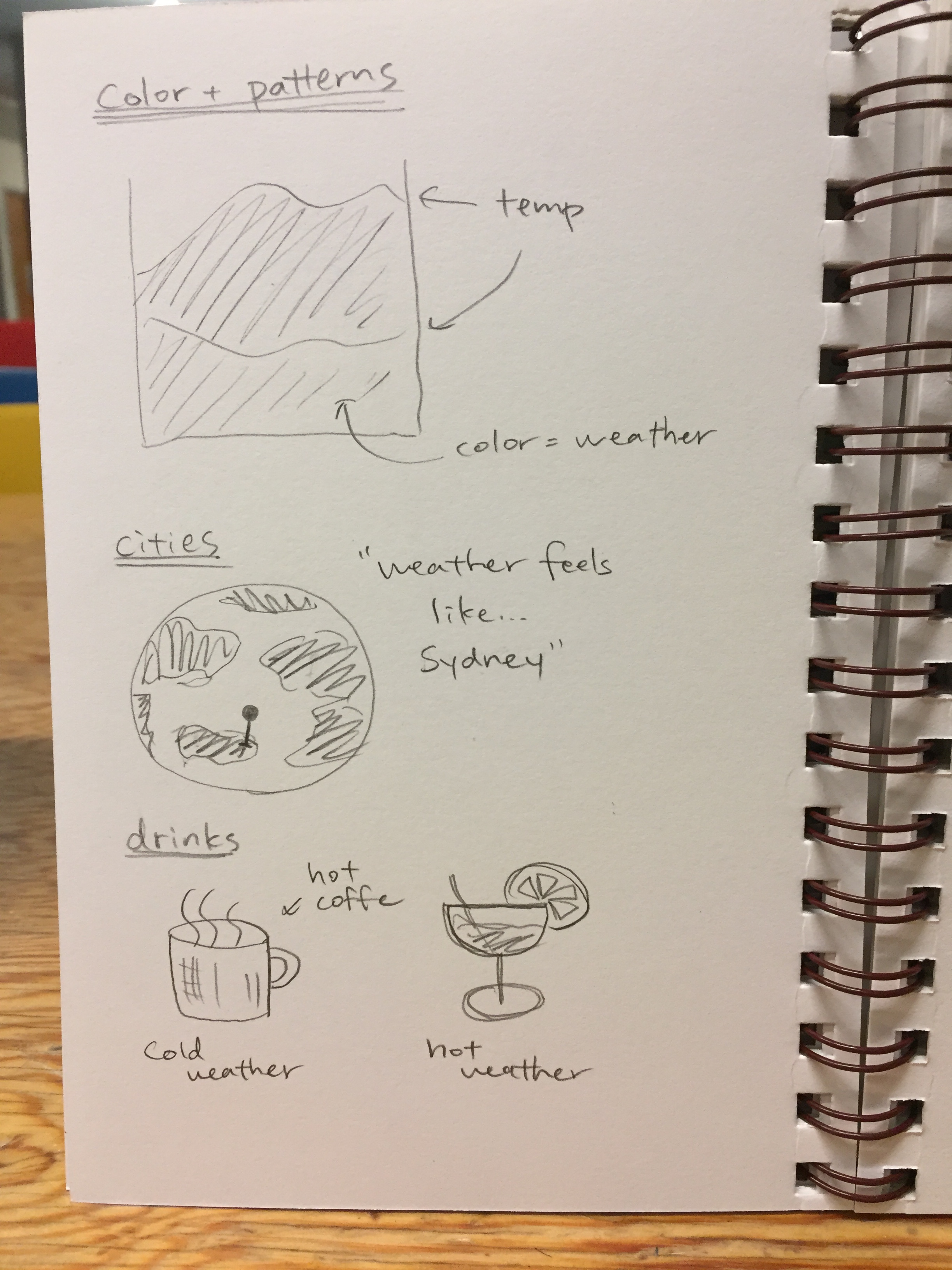
Sketches
Mockups
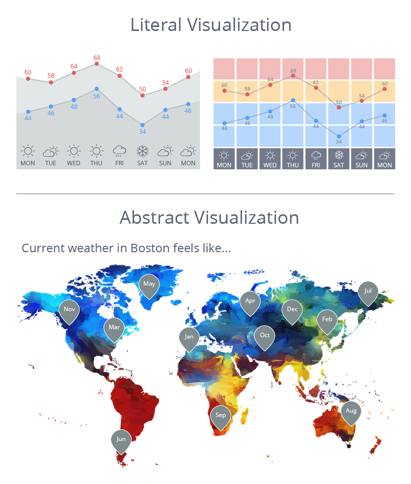
Literal Visualization
This weather dashboard has two line charts: Top shows the temperature every 3 hours for the next 24 hours. Bottom shows the daily high and low temperatures for the week. Background colors represent how certain ranges of temperatures feels. For example, really cold temperatures (~40 degrees) is shaded blue; chilly temperatures (40~60 degrees) is shaded light-blue.
BOSTON
Today
This Week
Abstract Visualization
This weather dashboard compares today's temperature in Boston to monthly average temperatures in four other cities. Each city shows the month whose average temperature most cloesly matches Boston's temperature today or displays 'NEVER' if a city never gets as cold or hot as Boston today.